The Next Bilbon
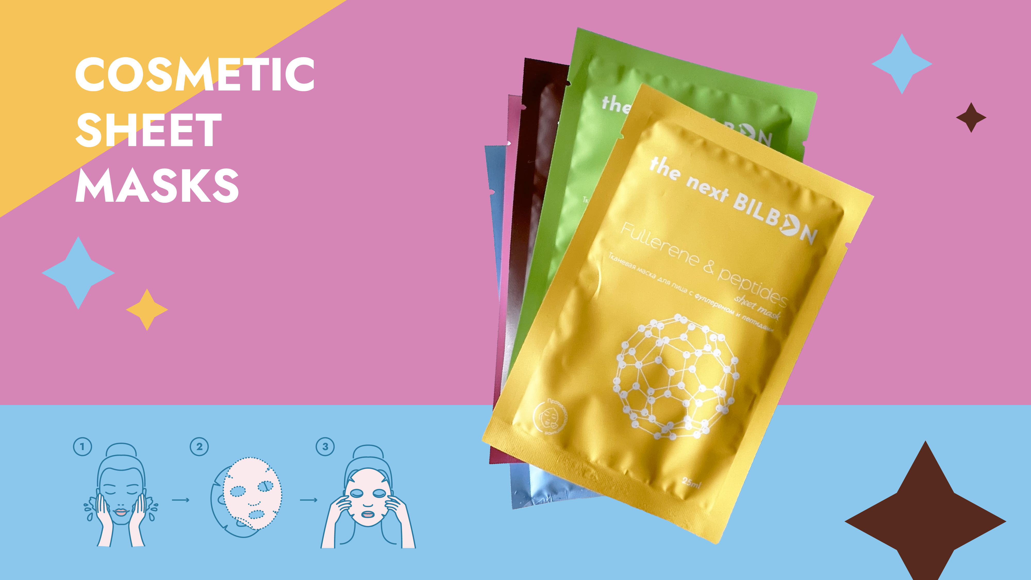
Our design approach was to create a sleek and modern look that reflected the high quality
and effectiveness of the product.
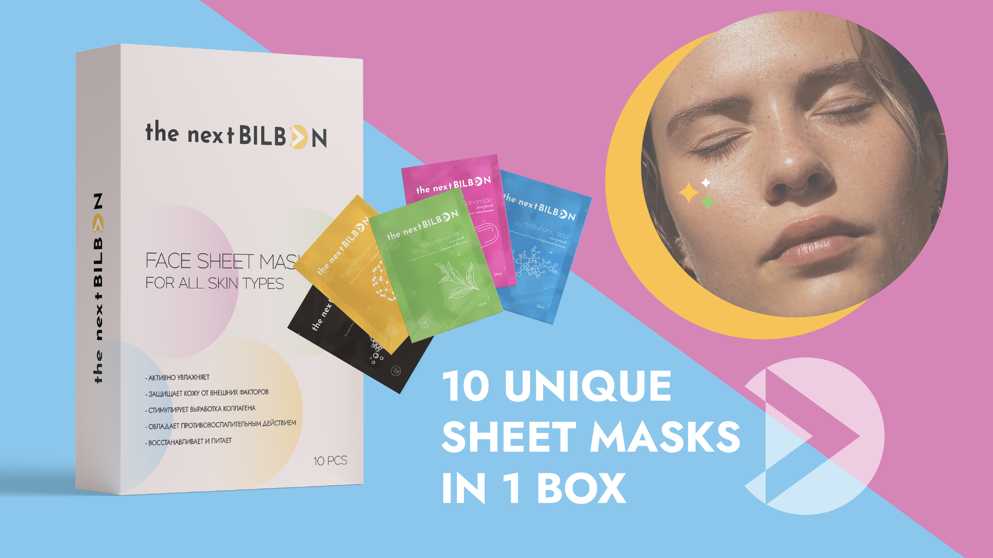
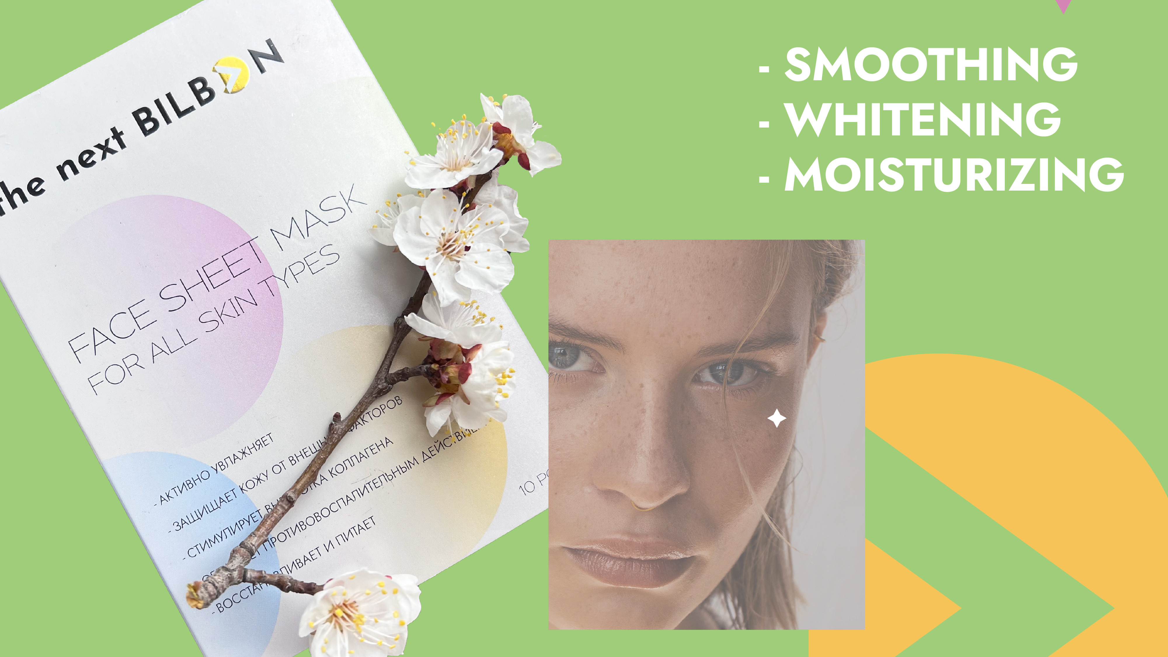
We started by designing the main box, which features a minimalist and elegant design that highlights
the product's name and key features. The box is made of sturdy and sustainable materials, with a s
oft-touch finish that adds a luxurious feel to the product.
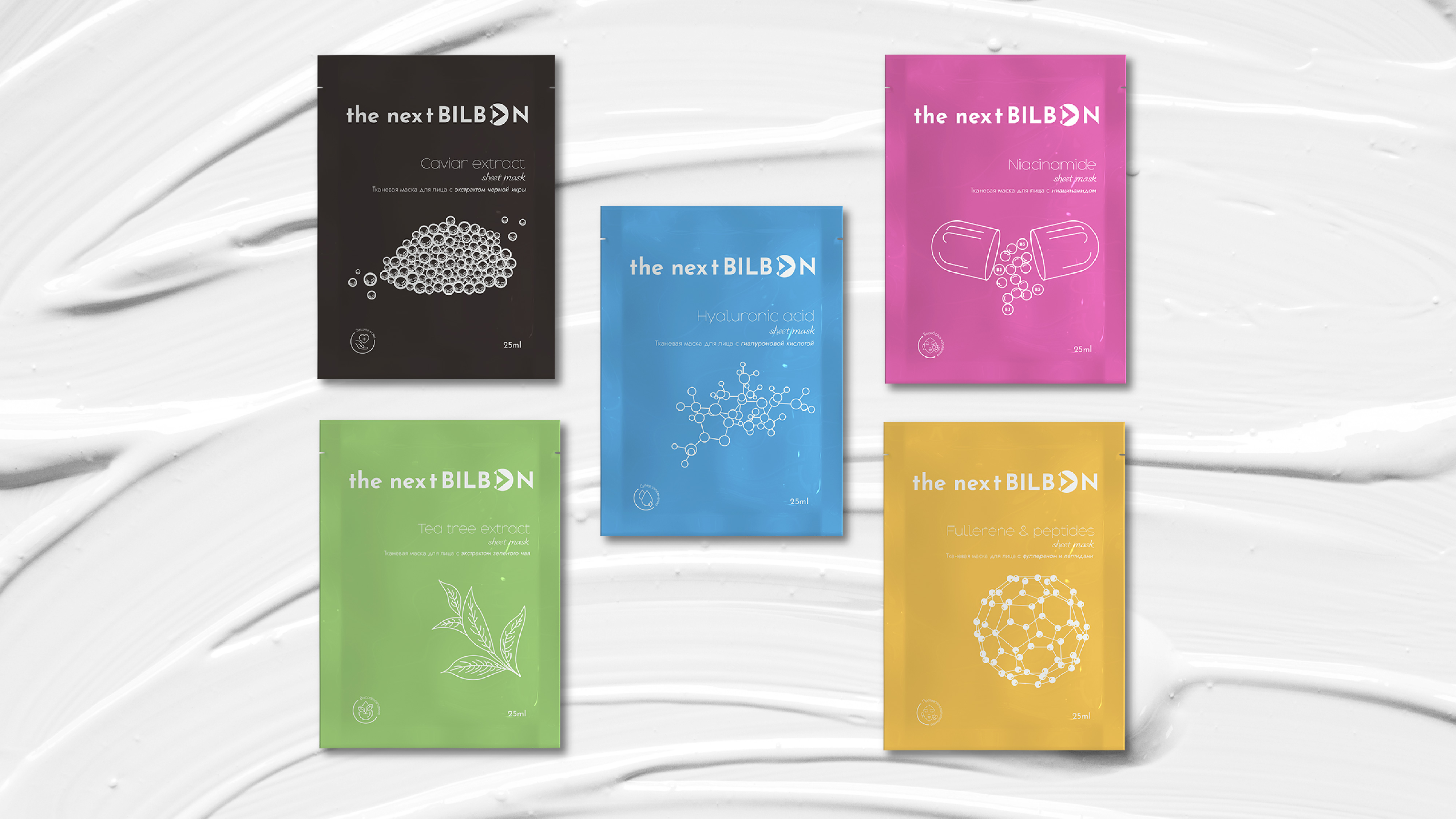
For each of the 10 masks, we created a custom design that showcases the main ingredients and benefits
of the mask. The design is clean and simple, with a color scheme that corresponds to the ingredients of
each mask.
We also included clear instructions and usage tips on each pocket to ensure that customers get the most
out of their mask.
Overall, our packaging design for "The Next Bilbon" face mask set is not only visually appealing but also
functional and user-friendly. It makes a great addition to any skincare routine and is sure to impress customers
with its premium look and feel."
